Finally: Dynamic charting in WSS, no code required!
- Finally: Dynamic charting in WSS, no code required!
- Finally: Dynamic charting in WSS, no code required! – Part 2
- Finally: Dynamic charting in WSS, no code required! – Part 3 – Multiple Pie Charts
A note from Mark Miller: When i first saw this solution, my jaw dropped! Could this actually be a viable alternative for WSS users who don’t have Excel Services? You be the judge… please give Claudio some feedback on how you will use his solution.
Update: The script has been updated so that the page loads before the script is triggered. You can read more about it in the comments.
Author: Claudio Cabaleyro , MOSS 2007 – (almost) no-code solutions
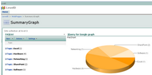
Inspired by the GREAT jQuery series by Paul Grenier at EndUserSharePoint and the TERRIFIC ideas of Christophe at Sparklines and other charts in SharePoint lists, I have built a small jQuery script and used Google Charts service to get the following (click to enlarge):

I based the example in a FAQ list, so the chart shows the distribution of questions among the different “Topics”.
Being a little more general, the chart shows the statistical distribution of items from an underlying SharePoint list, being the groups defined by the meaning of the column chosen to “Group by” in the list view.
You can think of representing statuses of an issues list, completion percentages on a task list, and so on. You can even explore the use of calculated columns in innovative ways to define your groups… (I just thought about that!)
Solution
I will not present a detailed step-by-step approach here, you can drop me a note if you have doubts.
Recipe:
- On the list you want to base your chart, create a “Group By” view.
- Create a new web part page and insert the just created list view.
- Insert a Content Editor Web Part and paste the code below (remember to use the Source Editor).
That’s it!
NOTICE: if you are new to jQuery, you need to install it prior to use the code. You just need to upload it on a Document Library as explained here, Do not forget to adjust the path at the beginning of the code, to point to your library.
*** UPDATE: when you copy the code to your script editor, take a look at quotes (single and double) as they can cause a wrong script.
<div id="jLoadMe" class="content"><strong>Pie Chart Using Google Charting API</strong></div>
<script type="text/javascript">
if(typeof jQuery=="undefined"){
	var jQPath="http://ajax.googleapis.com/ajax/libs/jquery/1.3.2/";
	document.write("<script src='",jQPath,"jquery.js' type='text/javascript'><\/script>");
}
</script>

<script
type="text/javascript">
$("document").ready(function(){
	var arrayList=$("td.ms-gb:contains(':')");
	var coord= new Array();
	var labels= new Array();
	$.each(arrayList, function(i,e)
	{
		var MyIf= $(e).text();
		var txt= MyIf.substring(MyIf.indexOf('(')+1,MyIf.length-1); // Extract the 'Y' coordinates
		coord[i]=txt;
		var txt1= MyIf.substring(MyIf.indexOf(':')+2,MyIf.indexOf("(")-1); // Extract the labels
		labels[i]=txt1+"("+txt+")";   //add also coordinates for better read
	});
	var txt= coord.join(",");
	var txt1= labels.join("|");
	// Adjust Chart Properties below - See Google Charts API for reference
	var vinc= "<IMG src='http://chart.apis.google.com/chart?cht=p3&chs=750x200&chd=t:"+txt+"&chl="+txt1+"'/>";
	$("#jLoadMe").append("<p>"+vinc+"</p>")
});

</script>
Tips and Tricks
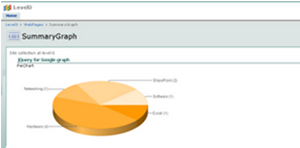
TIP I: you can hide the list view in your page so only the chart is rendered (click to enlarge):

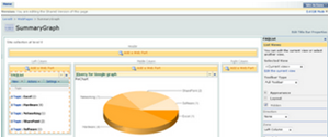
To do that, edit the page and look for the “Hidden” check box in the web part panel(click to enlarge):

TIP II: you can experiment changing the chart type, colors and size through the parameters in the URL by the end of the code. Check the Google Charts API documentation and have fun!!!
Author: Claudio Cabaleyro , MOSS 2007 – (almost) no-code solutions
- Finally: Dynamic charting in WSS, no code required!
- Finally: Dynamic charting in WSS, no code required! - Part 2
- Finally: Dynamic charting in WSS, no code required! - Part 3 - Multiple Pie Charts


Hi,
This code works really great.
I m not good at coding. Is there any way to customize the color of each bar in the colomn Chart?
Thanks,
-Sangeetha
I am utilizing the Google Charting solution discussed here to display action item status on an https site. The chart is linked to a list and displays a summary bar chart of the action items’ status (On Track, Complete, Major Issue, Minor Issue, Not Started). I understand that this presents a mixed content issue as the data is displayed over the https site. I enabled the “Display Mixed Content” setting in IE8, and the graph displays fine with no prompting box. My question is, what is Google logging from their side with regards to the chart? Are they only seeing the chart data (on track, complete, etc.) or do they have access to the list to which the chart is linked?
Google doesn’t have access to the list, it “only” gets the data you are sending. In this example, you are sending all the information contained in the grouping headers: Excel(1), Hardware(4), etc.
Thanks, thats just what was previnting me to display the chart.
Is there a limit of list entries? seems like those charts cant display more than 10 or 20 entries…
and I would like to know if there is a way to display the entries in a different way. right now the chart is showing the numbers of items grouped by. I would like the chart t pick the sum of a column referring to that group.
so if a group has for example made a profit of 20 k I would like to compare that group to others with the help of this chart.
Hope you guys understood what I mean and have some suggestions.
Thanks
Daniel
All,
I’d like to change the pie chart to either a heat map, or a geo map.
Is this possible using the code posted above?
If so, can what changes do I need to make?
Thanks!
Great post guys,
I’ve been using the fantastic ideas put forward this site, and the jQuery series by Paul Grenier plus great ideas of Christophe, @ path to SharePoint. One question though, Has anyone looked into using the Google API discussed in this panel, on the DVWP, where items are “grouped by”, and totals added to the footer.
Thank you all for the valuable insight provided on this site. My next question deals with multiple charts on the same page, pulling info from different lists. Right now I am able to create one chart associated with a specific list, however when I try to add another list to the page and create a second chart from the new list, all the data is displayed on the original chart. Is there a specific process I need to undertake in order to display multiple charts on the same page? thanks in advance….nate
Hi,
I have created a list with some data, and grouped on one of the fields, i have inserted this list in 1 of the webpart and i’m able to c the grouped view of the list, on the second webpart zone i have added the content editor webpart and in the source added the script that has been provided in ur sample above, i changed the src path to point to the location where my jquery.js is uploaded.
but still i’m not able to c the chart, what is missing here.
plz help as i’m stuck since long in this.
Many thanks for the tips – just what I need. Can you tell me though, it is possible to chart based on 2 group levels? I have a list grouped first by programme name and then by workstream name – I can get a great graph showing programme detail but want to see both programme and workstream. Is this possible? (PS I am not a developer of any kind, just slowly working my way through this!)
I have created two pie charts – one doesn’t display any labels, the other doesn’t display at all.
For the one with no lables I have used the following:
cht=p&chs=200×200&chd=t:”+txt+”&chco=0000FF
(The labels I would expect to see are 1, M E, P Cr and TFO. I don’t want to code these in as they will change going foward.)
For the one with no display at all I have used the following:
cht=bvg&chs=850×200&chd=t:”+txt+”&chl=”+txt1+”&chxt=x,y&chxr=1,0,50&chbh=5
(The graph shows the axes but nothing else. The x axes shows -1 but nothing else.)
Any suggestions much appreciated.
Does this code work for MOSS 2007 as well? I followed the steps and edited the path in variable jQPath to point to my document library folder containg the jquery.js file but i am unable to see the charts. Please let me know the reason for this.
Hi
I was wondering if you perhaps have code available as the solution example above for a scatter chart
I am trying to do this but really struggling. Got the Pie graph to work!
Thank you
Ruane